MinCultura Portal
A government web portal redesigning how Colombia's Ministry of Culture organised and communicated its programmes, departments, and cultural institutions to the public.

MinCultura portal
The official web portal for Colombia's Ministry of Culture, 2013 to 2018.
MC-PORTAL-2013
THE GOAL
Build a unified web portal for Colombia's Ministry of Culture, targeting 150,000 unique monthly visitors by August 2014.
Replace a fragmented digital presence with a content system the Ministry's communications team could manage, audit, and align with institutional objectives.
Success signals
150,000 unique monthly visitors by August 2014.
One consistent institutional identity across all published content.
A standard process for creating and publishing microsites and special pages.
THE PROBLEM
The previous portal had grown by accumulation. Directorates, Ministry pages, and cultural policy all sat together in one undifferentiated "Main Menu."
Journalists struggled to find updated information. Internal teams had no consistent way to manage or audit content across Directorates. The site's structure didn't reflect how the Ministry actually worked.
Key issues identified:
CONSTRAINTS
Every design decision had to work within boundaries that were set before the project started.
These constraints shaped every decision. Working within them was the job.
RESEARCH APPROACH
Understanding the site's real problems meant talking to the people who used it every day.
Methods
Stakeholder interviews with content administrators across all seven Directorates.
Satisfaction survey sent to the press office's direct contact list.
Direct feedback sessions with the Ministry's communications team.
Participants
Internal content administrators from each of the seven Ministry Directorates.
77 journalists responded from a universe of 1,000 direct press contacts.
Ministry communications team and senior leadership, including the Minister's office.
Key research questions
Key findings
Pain-point audit
The Minister's office and the communications team had already flagged the problems directly. Mapping their feedback against the previous site's sitemap showed where the structure itself was failing.

The site's structure didn't reflect how the Ministry worked, or how people actually looked for its content.
Affinity map
Feedback from the Minister's office, the communications team, and the systems team pointed to the same problems. Grouping every signal made the pattern clear.

The structure problems were feeding weak discoverability, and both were undermining the Ministry's own content strategy.
SYNTHESIS OUTPUTS
User types
Three groups shaped every structural decision, each with a different reason to use the site.

The Journalist
Primary motivation: reach press content fast without digging through the site.
External journalist covering Ministry news and events.
Needs
· Quick access to the news homepage.
· Find press releases by date.
· A direct contact point for the press office.
· Multimedia in one place.
Motivations
· Work against tight deadlines.
· Confirm facts without waiting on a reply.
Frustrations
· Releases and multimedia scattered across the site.
· No organised historical archive.
· Multimedia with no search function.
· Press contact hard to find.

The Citizen
Primary motivation: understand what the Ministry offers and find a relevant programme.
General public looking for cultural programmes or services.
Needs
· Understand what each Directorate does.
· Find nearby affiliated entities.
· Apply to cultural open calls.
· Know whether a process is online or in person.
Motivations
· Access a cultural opportunity or benefit.
· Avoid wasted trips or unnecessary steps.
Frustrations
· Can't tell Directorates apart from affiliated entities.
· Open calls buried several levels deep.
· Institutional language hard to follow.
· Drops off before finishing a process.

The Internal Officer
Primary motivation: publish their Directorate's content without friction.
Staff member responsible for content in a Directorate or affiliated office.
Needs
· Publish content easily.
· Stay consistent with guidelines.
· Coordinate with the communications office.
· Measure the reach of their own content.
Motivations
· Keep their Directorate visible and current.
· Justify their work with real numbers.
Frustrations
· No standard publishing process.
· Slow manual approval between areas.
· No metrics on their own content.
· Duplicated effort between Directorates.
Information architecture
The 2013 structure separated Direcciones from Ministerio, giving the areas their own branch alongside citizen participation and transparency.
On the previous site they were mixed into a single "Menú Principal," with no distinction from general Ministry content.

Structure principle
Every Directorate opened with the same five entry points: Quiénes Somos, Convocatorias, Preguntas Frecuentes, Publicaciones, and Noticias.
Below that, each node repeated one content template: a short description and a directory.
Department trees
Three Directorates, Artes, Comunicaciones, and Patrimonio, were mapped in full detail as part of the 2013 redesign.


Each map was reviewed with its Directorate, then checked against the technical structure with the systems office, so what teams described matched what SharePoint could support.
DESIGN PROCESS
The design ran in two phases: building the structure, then rebuilding parts of it after launch. Both had to work within SharePoint and through an external vendor.
Approach
Eight templates were defined first, covering every page type on the site. After launch, the Minister's office sent a written list of structural complaints, and each one was checked against the live site before being specified as a change.
Wireframes
Five core templates defined the structure of the entire site. Every other page was a variation of one of these.


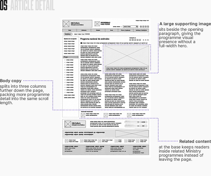
The same patterns repeated across templates, filters above the grid, pagination below, consistent card formats, turning eight separate pages into one predictable system.
Key Design Decisions
THE SOLUTION
The site in production, after the structural changes requested by the Minister's office were applied.
Core logic
Every page follows the same pattern: the full Directorate list in the top navigation, a section tree on the left, and the institutional government block closing every screen.
Before / After design comparison
Four page types, five years apart. Same content, rebuilt structure.


The same structure ran for five years, across three Ministers and thousands of published items.
UI DESIGN
The Ministry's institutional graphic manual set the rules: logo construction, colour range, and typography, aligned with the Presidency's own graphic system.
My work was applying those rules to interface, where the manual gave no guidance.
Colours
The manual defined a colour range built to read as cultural rather than bureaucratic. Primary, neutral, semantic, and accent tones were carried into every template.

Spacings
An 8-point grid and a single 1200px desktop breakpoint kept spacing consistent across templates. The site wasn't built to be responsive.

Logotypes
The mark combines Colombia's coat of arms, the containing lines, and the Ministry's name, with "Prosperidad Para Todos" alongside it on every page.
Button States
Default, hovered, focused, pressed, and disabled were defined for every interactive element, so the same logic applied whether the component was a button, a link, or a checkbox.

Typography
Futura was the required typeface, matching the Presidency's system. Verdana was the fallback for email and platforms where Futura wasn't supported.

The manual has been rebuilt for this case study using the original specifications.
One system across every template, so a visitor saw the same identity whether they landed on the homepage, a Directorate page, or an article.
OUTCOME
Peaked at 130,000 unique monthly visitors against a 150,000 target. Five years in production, three Ministers, one structure.
Content Migration
Bext (external vendor) moved the bulk of the content. My part was making sure nothing lost its address on the way.
01
What moved
Roughly a third of the site wasn't page content but downloadable documents, kept for transparency requirements regardless of file size.
Pages
166 URLs
67%
Documents
83 URLs
33%
Media
79 URLs
02
How it was split
Directorate administrators audited their own sections and decided what to keep, rewrite, or drop.
03
After launch
Search Console was checked daily for weeks. Broken redirects were the first thing to surface and the fastest to fix.
04
Traffic counter
The target was 150,000 unique monthly visitors by August 2014. The site reached 130,000.
Short of the number, but against a previous site that had no measurement at all. The public hit counter, visible on every page, went from zero at launch to 38 million within a year.

September 24, 2013
1,846,705 hits · 16 days after launch

September 4, 2014
38,215,952 hits · 1 year after launch
Iteration
The site launched, and the requests started arriving.
Sections in the wrong order, entities missing, programmes buried.
Each request came as a description, not a specification.
I turned them into graphic interpretations, then modified the CSS live to show the change before asking Bext to build it.
Showing the fix was faster than describing it.
What this project proved
Structure holds when it matches how an organisation works. The Directorate pattern lasted five years.
Content at institutional scale needs owners, not a manager. Each Directorate audited its own material.
Working through a vendor means specifying every decision clearly enough to build without you.
Learnings and reflection
Five years on one site teaches you more about process than about design.
The best decision I made there wasn't a design one. It was learning to show the fix instead of explaining it.

MinCultura portal
The official web portal for Colombia's Ministry of Culture, 2013 to 2018.
MC-PORTAL-2013